

Table of contents

Color can be a tricky thing, but it’s also one of my favorite topics to explore. So, what if you happened to be looking through Microsoft’s data type documentation for an explanation on color. You might be left wondering if they even really tried. I know I am.
A color specification, including an alpha channel.
This might be the most non-helpful explanation out there. Color is no joke, and when someone is attempting to build something for themselves, or more importantly for others, color is the vehicle of non-verbal communication. I could carry on for days (maybe even weeks) about color without exhausting. I’ve been obsessed with it all my life, and the obsession continues to grow every time I learn something new about it.
But what about that explanation above? What does that even mean? A color specification very literally is specifying the color to display, and the alpha channel is the level of transparency.
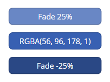
Color in Power Apps is typically defined either through specifying the color name (like one of my favorite neutral background colors Color.AliceBlue) or using the RGBA() function (like the default control color RGBA(56, 96, 178, 1)).
The good news is you don’t need to know the specifics of the RGBA() function to add color to your app. There’s a handy color picker built-in for each of the color properties associated with a control. And if none of those colors are interesting to you, there are several guides and sites available that can assist you with picking colors.
Color Resources
There is an entire guide on color available from w3schools that I have found helpful in the past. It’s a digital-color nerd’s haven. There are also these extremely helpful sites that I keep bookmarked for when I need inspiration or to check contrast:
- Color Kit – Color Palette Generator
- SchemeColor
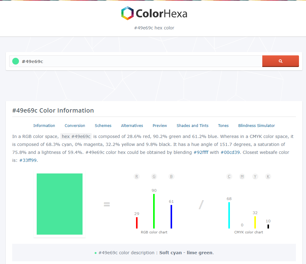
- ColorHexa
- Color Contrast Accessibility Validator (For checking compliance with web standards for color contrast)
Accessibility
With those last two links, they happen to have some of the most important tools for designing with color. Those tools are for checking accessibility. When designing an application, you want to be sure that your end-users can SEE it. Last thing you want to do is design an app with poor contrast in all green hues that a person with Red-Green color blindness has to use.
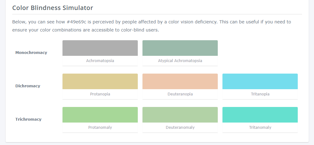
That’s why I love ColorHexa. I can input the color I want to use, hit enter, then scroll down to the bottom of the page to see a simulation of how different variations of color blindness perceive the color.
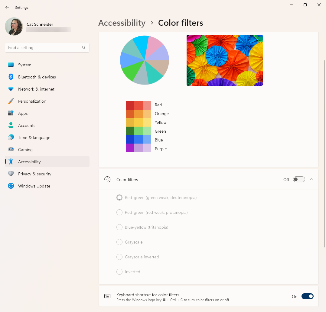
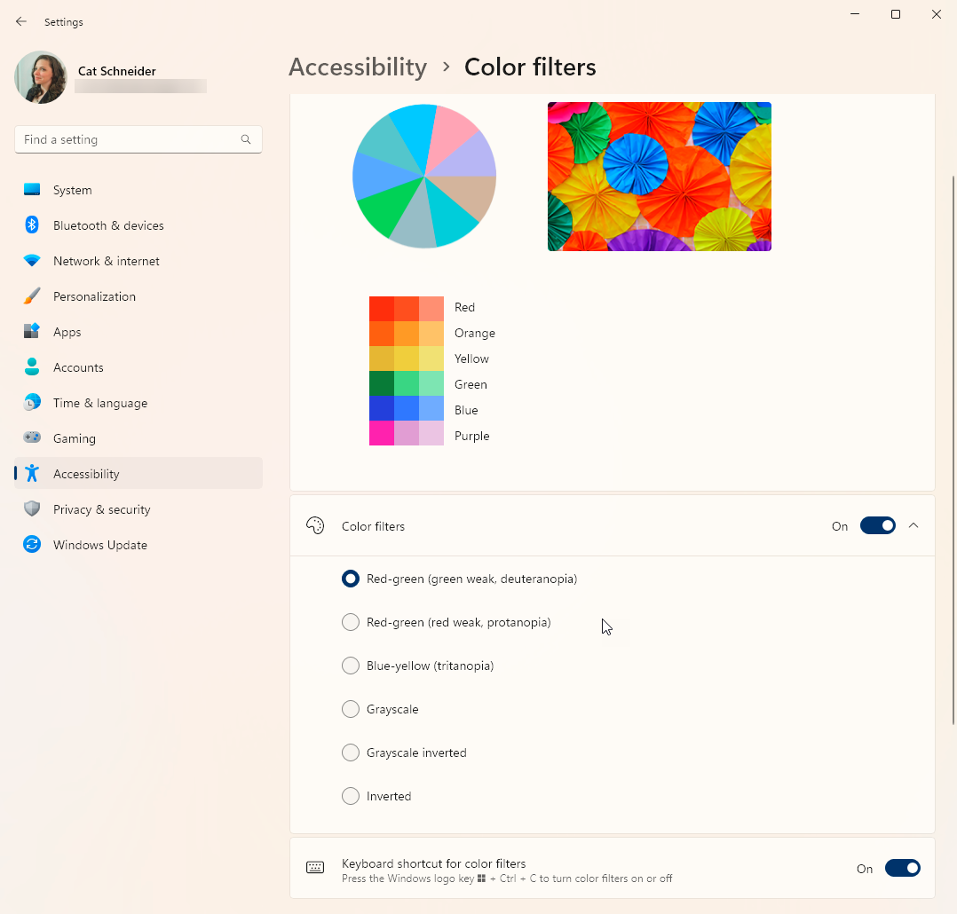
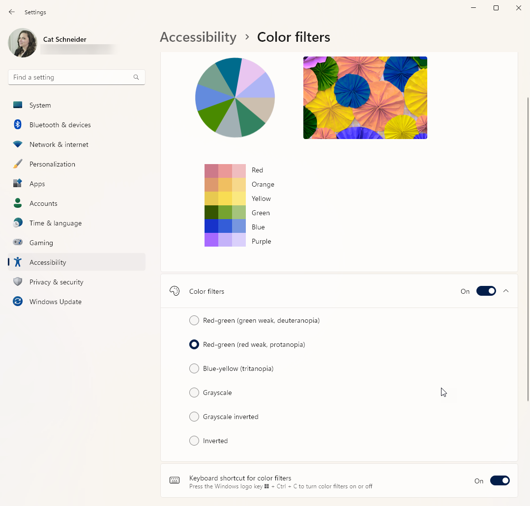
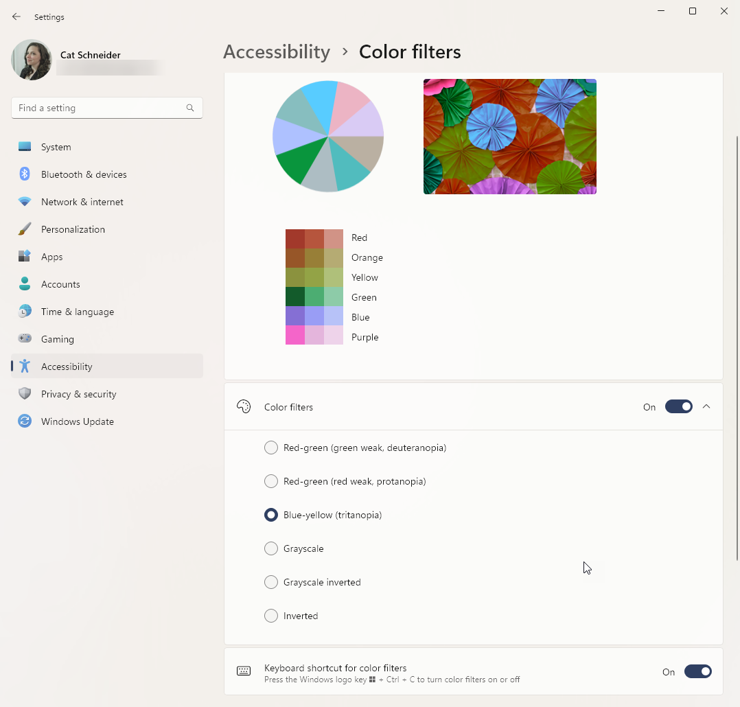
If you happen to be using a Windows 11 machine, there are accessibility tools available to you in settings that allow you to filter the colors on your screen. This is another way for you to see how color may be perceived on a system wide scale.
Now color blindness is just one way that color in your app may not be easily perceived by an end-user. Other ways include diminished sight from aging or disease, to even working in extremely bright environments.
I don’t say any of this to turn or scare you away from designing an app. Simply to provide some awareness that these things need to be considered if you start to get more serious about app design. Thankfully the themes provided from Microsoft within Power Apps meet accessibility standards, so you should be safe using them until you become more comfortable using color.
Color me intrigued
For those interested in a deeper explanation of the RGBA() function:
- The acronym stands for Red, Green, Blue, and Alpha channel values
- Each of the first three values are for indicating the intensity of the specified color. This can be a value between:
- 0 – no color
- 255 – full intensity of the color
- The last value, alpha, is for the amount of color transparency. This is a number ranging from:
- 0 – meaning completely transparent, or no visible color
- 1 – meaning completely opaque, or that the color cannot be seen through
Finally, there are two other functions in Power Apps that are specifically for color, and they are:
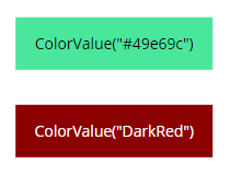
- ColorValue – requires a string value such as a hex code or CSS color name.
- Example: ColorValue(“#49e69c”) or ColorValue(“Red”)
- ColorFade – requires the color value and how much to change the color value either:
- Towards white – values between 0 and 1; or
- Towards black – between 0 and -1
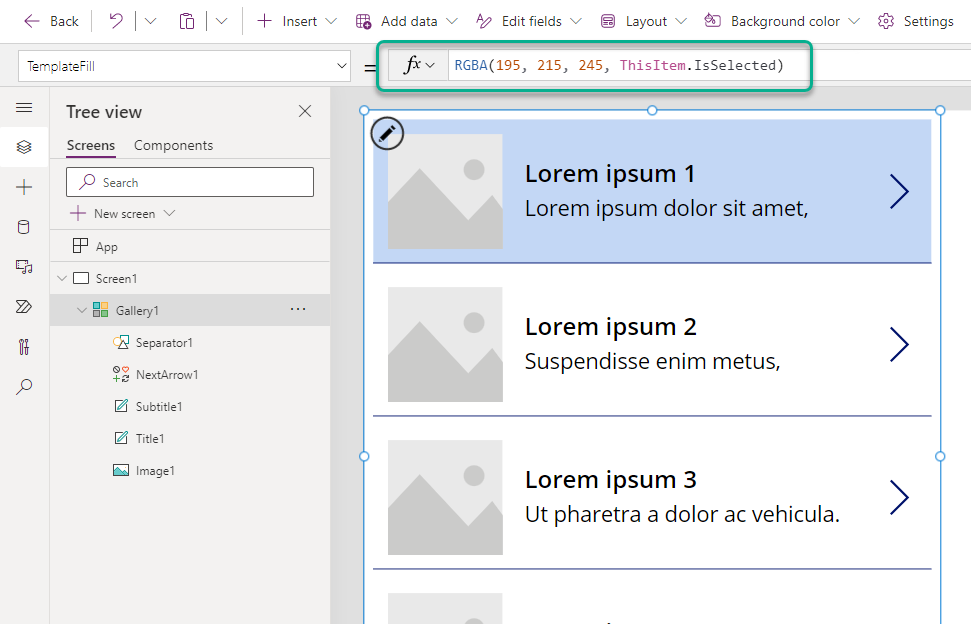
One last final bit before I go, a quick tip for you, when using a Gallery Control in Power Apps. If you want a visible indicator of the item currently selected in the gallery, use the TemplateFill property and set the alpha channel value to ThisItem.IsSelected.
interesting article.
this is a really good Colour Contrast resourcehttps://juicystudio.com/services/luminositycontrastratio.php